This site has helped my writing immensely. Many of the bloggers I follow belong to this group.
2010 Challenges
1) Jane Eyre by Charlotte Bronte(Done!)
2) Villette by Charlotte Bronte 3) The Tenant of Wildfell Hall by Anne Bronte (Done!)
4) Becoming Jane Eyre by Sheila Kohler 5) Movie: Jane Eyre (1997)(Done!) 6) Movie: Rebecca (1940)(Done!)
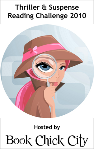
1) Why did they ask Evans?Agatha Christie(Done!)
2) Fever in the Bone Val McDermid 3) A Stitch in Crime Betty Hechtman (Done!)
4) Southern Storm Terri Blackstock
5) The Picture of Dorian Gray Oscar Wilde 6) Pretty is As Pretty Dies Elizabeth Spann Craig (Done!)
7) One Last Breath Stephen Booth (Done!)
8) The Grave Tattoo Val McDermid 9) The Killings At Badger's Drift Caroline Graham(Done!)
10) This Body of Death Elizabeth George
11) Careless in Red Elizabeth George
12) Black Dogs Ian McEwan
1) Fever in the Bone Val McDermid 2) Howard's End EM Forster (Done!) 1) Jane Eyre by Charlotte Bronte(Done!) 4) Mrs. Dalloway by Virginia Woolf (Done!)
I'm trying to make this site more eye-friendly. Do you find it too cluttered? If yes, please suggest ways I can improve this site.
Thanks,
Ann
3
comments:
Anonymous
said...
I loved the double carousel widget. That really caught my eye the first time I popped in.
What bothers me (if you're asking -- it isn't enough to bother me really) is that the site doesn't fit within my screen. I have to scroll right and left to see it all.
Also, the title takes up the entire screen until you scroll down, and because it's brown and I have no idea what the symbol is supposed to be, it isn't eye-catching. It doesn't appear to have anything to do with writing, either, so it's immediately a turn-off for me.


3 comments:
I loved the double carousel widget. That really caught my eye the first time I popped in.
What bothers me (if you're asking -- it isn't enough to bother me really) is that the site doesn't fit within my screen. I have to scroll right and left to see it all.
Also, the title takes up the entire screen until you scroll down, and because it's brown and I have no idea what the symbol is supposed to be, it isn't eye-catching. It doesn't appear to have anything to do with writing, either, so it's immediately a turn-off for me.
(Only since you're asking!!)
:)
Thanks for your comments. I will be working on the site over the next few weeks.
ann
Oh, I love that new title box!!! SOO much better. Less overwhelming, and it applies to reading/writing now. Really nice. :)
Post a Comment